Disclosure: this post was written with the assistance of an AI system (Claude), which wrote the analysis code, ran the experiments and drafted the text. The topic, the constraints, the data choices and the final review are the author’s.
On 31 July 2026 the KOSPI rose 17.91%, the largest one-day gain in its history, and Korean individuals net sold a record 8.2543 trillion won into it. So I priced the rule: selling every 15% drawdown cost 2.40 percentage points a year in my simulations. I expected the cost to be missed rebounds, and a matched control says it is not — five sixths of it is simply being out of a rising market for 10 of 20 years, and the rest comes from a re-entry rule that will not buy back until the index has risen 12%.
Two records, one session
On 31 July 2026 the KOSPI rose 17.91% — the largest one-day gain in the index’s history. In the same session, Korean individuals net sold 8.2543 trillion won, their largest daily net sale on record, and foreign investors net bought 7.2197 trillion won, theirs. Over the week individuals net sold 6.5437 trillion.
I want to be careful about what that does and does not show, because the tempting reading is a story about panic and the data cannot support it. An aggregate net sale is the sum of forced margin liquidations, resting limit orders, index rebalancing and deliberate decisions, and the four are indistinguishable in a single number. Somebody being liquidated on the best day of the decade is a different phenomenon from somebody choosing to sell into it, and you cannot tell them apart from the tape.
What is worth doing instead is pricing the rule. Forget who did it and ask the mechanical question: if an investor reduces exposure after losses and restores it after gains, what does that cost, and where does the cost come from? That is computable, it needs nobody’s flow data, and the second half of the question turned out to have a different answer from the one I was expecting when I started.
The two returns of the same asset
Start with the distinction that makes this measurable.
The number a fund reports is a time-weighted return: compound the index’s daily moves and annualise. Every investor holding that index sees the same figure, and it is indifferent to when anybody’s money arrived.
The number an investor earned is a money-weighted return — the internal rate of return of their actual cash flows. It is the rate that, applied to each contribution for as long as that contribution was invested, reproduces the final account value.
For a single lump sum held to the end the two are identical. As soon as money moves they separate, and the difference is nothing but the timing of the flows. There is no term in that arithmetic for how anybody felt.
So I built five investors in a simulated market — 20 years of daily returns with volatility clustering and a 7% drift, run 500 times over — who hold the same index and differ only in when their money moves:
- steady contributes one unit a month, forever, and never sells
- chases the rally doubles up after a month better than +3% and withdraws after one worse than -3%
- buys the dips does the exact opposite
- panic sells contributes steadily but liquidates the whole account when the index is 15% below its peak, returning when it has recovered to within 5%
- absent at random is the control that makes this post work, and I will come to it in a moment
The index earned 6.5% a year for all of them.
Exits matter. Contribution timing barely does.
The three rules that only vary their contributions land within a third of a point of the index: chases the rally at -0.08 percentage points a year, buys the dips at +0.27, steady at +0.06.
That surprised me and it is worth sitting with, because it is the opposite of how these arguments usually go. Doubling your monthly contribution after good months and withdrawing after bad ones — for twenty years — cost about 0.08 of a percentage point. The reason is unglamorous: after a decade of contributions the monthly flow is small relative to the account, so tilting it moves almost nothing. If your worry is that you are bad at timing your monthly transfer, the arithmetic says stop worrying.
Panic selling is a different animal: -2.40 points a year. Same asset, same index, same 6.5%. It is negative in 81% of the 500 histories, so it is not bad luck.
And before any interpretation, the number that explains most of it: that rule spent an average of 10.2 of its 20 years in cash. A 15%-drawdown trigger with a 5% re-entry is not a mild risk control. In a market with this much volatility it is a decision to be out of the market more than half the time, and I did not appreciate that until I measured it.
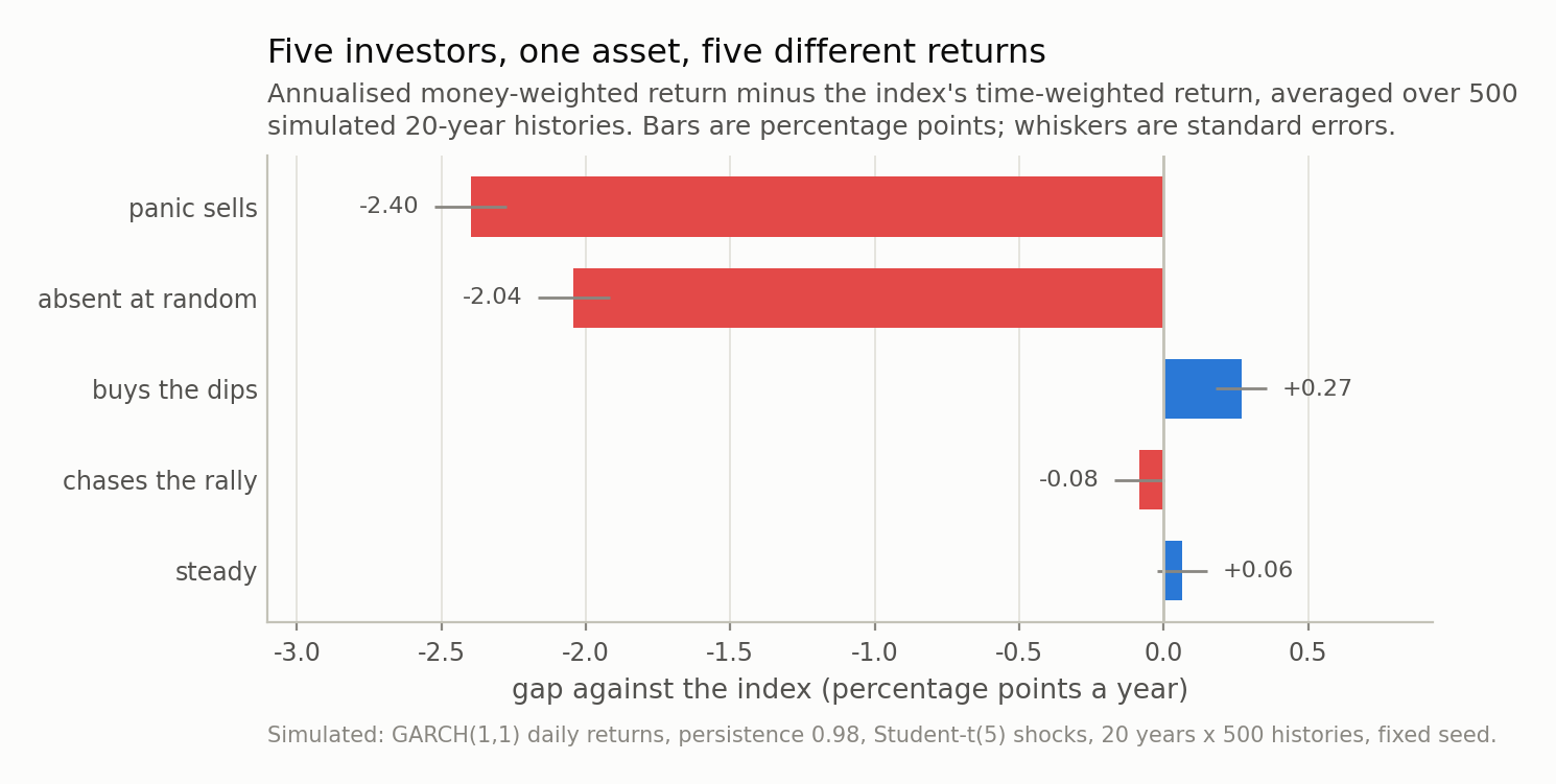
Fig 1. Every rule holds the same index and sees the same 6.5% a year; only the timing of the money differs. Note the two groups: the contribution tilts are worth a fraction of a point, while the exit rule costs 2.40 points. And note the matched control at -2.04 — an investor absent for the same days at random times, which is most of the way there.
I expected the rebound. It was mostly the drift.
Here is the hypothesis I started with, straight out of the previous post in this series: the best days sit inside the crashes, so a rule that exits on a drawdown is absent precisely for the rebound, and that is what it costs.
To test it I need a counterfactual that separates “out of the market” from “out at the wrong moment”. Comparing the panic rule with buy-and-hold cannot do that, because it changes both at once. So: absent at random — an investor out of the market for the same number of days, in absence episodes of the same lengths, placed at random times. Same contributions, same cash rate, same everything except when the absences fall.
That investor’s gap is -2.04 points a year, against the panic rule’s -2.40.
So the decomposition is:
- 2.04 of the 2.40 points — about five sixths — is simply being out of a rising market for a decade. Nothing clever, no timing, no rebound. Forgone drift.
- 0.36 points is attributable to when the absences fell.
The big number is the boring one. “I sold and sat in cash for 10 of twenty years” explains most of the damage before any behavioural story starts, and a story about missing rebounds was doing work that plain arithmetic had already done.
The “missing the best days” channel is smaller than I expected too. The panic rule held 45% of the market’s top-1% days; the random absentee held 49%. Under five percentage points apart, for the same time out.
And the timing part is not clustering either
That leaves 0.36 points of genuine timing cost, which I still expected to be made of volatility clustering. It is not, and the control is unambiguous about it.
I re-ran everything against markets with the same average volatility and rising persistence, from zero — independent draws — up to the 0.98 typically estimated on equity indices. Holding the unconditional variance fixed matters: if raising persistence also made the market louder, the louder market alone would widen every gap.
If clustering were the mechanism, the timing-only gap would grow with persistence. It shrinks: -0.76 points with independent returns, narrowing to -0.37 at equity-index persistence. Clustering makes this rule’s timing slightly less costly, and the distribution in Fig 3 says the same thing from the other side: the no-clustering version of the panic rule averages -3.25 points against -2.40 with clustering. Worse, not better.
The actual mechanism is in the rule’s own definition, and here is the table where it shows up:
| investor | what they earned | gap | years in cash | best days held | index move while out |
|---|---|---|---|---|---|
| steady | 6.5% | +0.06pp | 0.0 | 100% | — |
| chases the rally | 6.4% | -0.08pp | 0.0 | 100% | — |
| buys the dips | 6.7% | +0.27pp | 0.0 | 100% | — |
| absent at random | 4.4% | -2.04pp | 10.1 | 49% | +11.2% |
| panic sells | 4.1% | -2.40pp | 10.2 | 45% | +13.7% |
While the panic rule was in cash the index rose 13.7% per absence; while the random absentee was in cash it rose 11.2%. Of course it did. Exiting at 15% below the peak and re-entering at 5% below it means the index has to climb about 11.8% before the rule is allowed back in. The rally is not something the rule unluckily misses. It is the re-entry condition. You wrote a rule that will not let you own the asset until it has gone up, and then you were absent while it went up.
None of that contradicts the earlier post — the best days really do cluster inside the crashes. It says that for this rule, that effect is a minor term next to two larger ones: the drift you are not earning, and a re-entry threshold that guarantees you buy back higher than you sold.
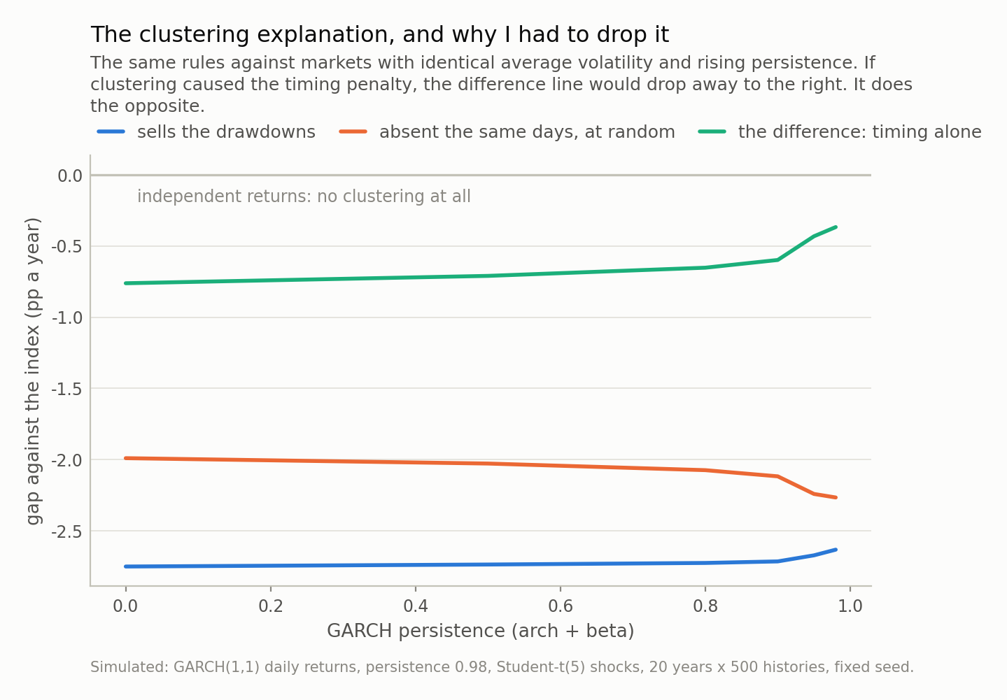
Fig 2. Both cost lines are nearly flat in persistence, so the bulk of the penalty is not about clustering at all — it is forgone drift. And the timing-only difference goes the wrong way for my hypothesis: -0.76 points with independent returns against -0.37 at equity-index persistence. Clustering makes this rule’s timing slightly less costly.
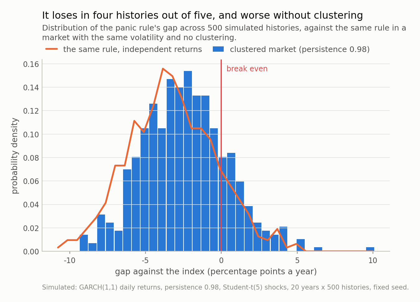
Fig 3. The distribution is shifted, not merely wide — the gap is negative in 81% of histories, so this is systematic and not bad luck. The overlaid curve is the same rule with clustering switched off, and it sits further left, at a mean of -3.25 against -2.40. That is the figure that killed the explanation I came in with.
Where I am overstating it
Four places, and the first one moves the number a lot.
Cash earns nothing in my headline figures. That is the objection I would raise first, and it matters more than I expected: at a 3% cash rate the panic rule’s gap is -1.11 points instead of -2.40. More than half the penalty is the yield you would actually have earned on the sidelines. The ranking survives and the mechanism survives, but anyone quoting “panic selling costs 2.4 points” — including this post’s own chart — is quoting a zero-interest world.
My thresholds are aggressive. Exit at 15% below the peak, re-enter at 5%: that combination is out of the market 10.2 years in 20 here. A wider re-entry band would spend less time in cash and forgo less drift, and the timing term would shrink with it, because the re-entry gap is the timing term. Someone should sweep those two thresholds; I have not, and the honest read of my figure is that it prices one particular rule rather than “selling drawdowns” in general.
GARCH is not the market. It reproduces clustering and fat tails, which is what the argument needed, and it has no jumps, no regime changes and a symmetric response to good and bad news that equity indices measurably violate. The asymmetry would matter here: real volatility rises more after falls, which lengthens absences.
And the Korean flow numbers are a hook, not evidence. I have estimated nothing from them. What individuals as a group earned in 2026 is a question for account-level data, which I do not have and almost nobody outside a regulator does.
What I would actually take from this
A drawdown rule is a market-timing strategy, and it should be backtested like one. “I sell when the index is 15% down” has an entry rule, an exit rule and a measurable cost, and most of that cost is knowable before you look at a single rebound: it is the drift you will not earn while you are out, times how long the rule keeps you out. Compute that first. If the answer is “out half the time”, the rest of the analysis is a rounding error.
Look at your re-entry condition before your exit condition. The exit is the part people agonise over and the re-entry is where the money goes. Any rule that requires a recovery before it buys back has written “buy higher than I sold” into itself. If you want a rule, put the re-entry on a calendar, not on a level.
Ask which return a fund is quoting you. Time-weighted is the industry standard and it is the right number for judging the manager. Money-weighted is the right number for judging your own outcome, and for a fund with volatile flows the two can differ by more than the manager’s entire claimed edge. Both are legitimate; only one is about you.
And keep the counterfactual matched. The reason this post has a finding rather than a moral is one extra simulated investor: absent for the same days, at random times. Without it I would have written the story I expected — clustering, rebounds, discipline — and the numbers would have looked like they agreed with me, because 2.40 points is a big number and big numbers are persuasive even when their explanation is wrong.
Next in this series: the KOSPI has more than 800 listed companies, and I want to find out how many of them a “diversified” index position is actually a bet on. That one has a formula too, and the answer is a much smaller number than 800.
Data
- Flow and index figures are quoted from published reports, not from a redistributed price series. 31 July 2026: the KOSPI rose 17.91% (+1,001.89 points) to 6,595.45, its largest one-day gain on record, while individuals net sold a record 8.2543 trillion won and foreigners net bought a record 7.2197 trillion won; individuals net sold 6.5437 trillion won over the week — Seoul Economic Daily, https://en.sedaily.com/finance/2026/08/03/escaping-the-rollercoaster-kospi-index-recovers-6600-eyes.
- Everything measured in this post is simulated with a fixed seed: GARCH(1,1) daily returns with Student-t shocks, 20-year histories, reproducible from the repo. No claim is estimated from Korean flow data.
Reproducibility
- seed: 20260804
- environment: standarderror=0.1.0, python=3.11.15, numpy=2.4.4, scipy=1.17.1
- market: GARCH(1,1) log returns with t(5) shocks converted to simple returns and given a 7% annual drift, unconditional daily sd fixed at 1.1% while persistence is swept over (0.0, 0.5, 0.8, 0.9, 0.95, 0.98) (omega solved from the target variance, so only the arrival pattern changes)
- histories: 20 years x 500 independent histories for the headline figures; 120 per point for the persistence sweep
- rules: one unit contributed per 21-session month; ‘chases’ doubles after a month above +3% and withdraws a unit below -3%; ‘buys dips’ mirrors it; ‘panics’ liquidates on a 15% drawdown and re-enters at 5%
- money-weighted return: IRR by bisection on the terminal-value identity, annualised; a rule’s own reallocation between the index and cash is not a cash flow, because the money never leaves the investor
- cash rate: 0% in the headline figures; at 3% the panic rule’s gap is -1.11pp instead of -2.40pp